Wednesday 1 June 2011

Emails to distribute...

I've just finished my email to 'Oh Comely' Magazine...When writing It I was mostly thinking about what their magazine stands for and it's audience and trying to show this off within my work. I found it hard to know how forward and confident I should be...

Hello :)

I'm an image and craft maker living and working in Leeds, I'm just coming to the end of my degree course of Visual Communication. Very scary!

I'm a massive fan of your magazine and feel very lucky to have found it over the past few months! :)
I particularly enjoy the relaxed and happy manner of the articles in it!

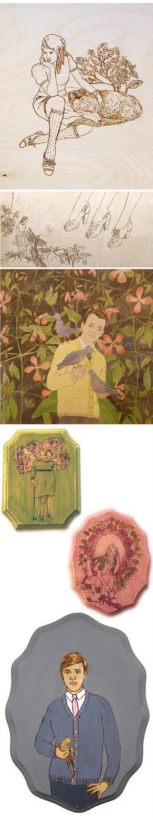
A current project that I'm working on has been built upon the subject of Beauty Ideologies and challenging this idea of 'beauty'. I've been making images and wooden brooches, discussing these ideas. The main focus on my image making is to laugh at the stereotyping of genders and take the pressure off for women, laughing with them, encouraging them to relax a little more about how the look. It's something I'm really passionate about and so I've done some work with the magazine in mind and wondered if you thought you could use it or would like anything else?

I've attatched a couple of images, but you can see more of my work on my website at... www.clairebellia.co.uk

Thanks for taking the time to read this :)
Claire xo


I've sent it and now I await a reply...

Designs for large Handmirrors...

Well these are my final drawings for the big cutter they have down in woodwork, I've got a trial one I'm doing on MDF on Friday, to see how the engraving work and if I will need to go over all of it with a pyrography pen.


I'm thinking that the size of them will be about 80cm tall...however, because of their awkward shape I will need to stick two pieces of wood together, fusing them well and then also stick them onto a layer of MDF to strengthen the whole piece to then be cut. It's going to be a long process but hopefully worth it!

The plan is to then have 3 of these with bits of my narrative in them...

Tuesday 24 May 2011

Final Sticker Designs...

Here are the final designs...
...and some photos of the final stickers...
I'm not to sure how I feel about the shiny gold backed ones as I think it changes the feel of my brand slightly. I'm very happy with the pink ones and I've very slightly changed the tone of the pink on the printed image sticker from what it was last time as I think it complements the sticker colour more and also makes the image pop out a bit more.
The final final stickers can be seen in my final work!

Sunday 22 May 2011

Sticker Designs...

Well the first lots I've designed are using the lady which I painted which communicates well, my practice and style of working...

However I put this together in illustrator and it doesn't look right and the words are to small...although I've been thinking whether I really need the words on the sticker as anyone who has their jewellery bag sealed with a sticker will get a business card inside their bag with all my details on anyway. Therefore I can either take the words off or have the words on for design aesthetics and it doesn't matter if you can't read it to well.

A problem I came across was trying to hide the little dashes from distorting the key images which needed to be in front... I had to work to find out that I could create a new layer and use the pen tool, to then kind of mask the area off and then shuffle around the layers for it to work...


Although from printing them and looking at them more, I don't like them and want to try different images... as iconic the lady is above to my style I have other work that would look better on a circle sticker. The image of the lady is more beautiful when she's big and the image looks forced and bizarre on a circular sticker, make the image look very rectangular and blocky.

Business Card Prep...

So...from the blogpost I did before on business cards, the other two were a bit of a flop, I constructed the second idea with the peep-hole, but it just wasnt time effective and I couldn't bind the edges well enough!
With this in mind I began on a 3rd design and I'ts now my final design. Preparing some bits for the final business card, decided that instead of a slightly boring front (the hand-drawn lady coppice title below). I will go for the key image on the front and have simple type on the back, hopefully looking professional but crafted.


BACK

The last image out of the four, just above, is the one I've finally chosen, the weight of the lines seems to complment the image on the front and works nicely...I have now printed the negatives and will take it to print over the next couple of days!

Friday 20 May 2011

Final Decided Brooch Narrative:

'A Series of brooches telling a story. Named 'Ages of Womanhood', It tells the story of a young girl who grows up to be obsessed with her appearance, then to fall in love for it to just fall apart. Feeling broken and upset, she finds herself feeling indignant and pretty hateful towards men...'

I have cut a couple and found that the lines need to be a little thicker, especially on the girl with the gun. I will thicken the lines and also bring the laser closer to the wood.


Thursday 19 May 2011

Adjustments To Brooch N Desgns...

These are the images I took to my crit today and it was really useful to hear peoples responses...

It drew to the conclusion that they didn't need to have symbols to emphasise anything, it would be nicer to make the images bigger and fill the frame instead! Also that the lady for the 2nd brooch (No.2) as pretty as she looked maybe this idea of 'appearance' needed to be exaggerated a bit more and so I will redesign it... I will make the 'lovers' bigger and will change the 'arguement' brooch.

Writing and choosing photos for Nation Of Shopkeepers Preview...

This is what I ended up writing and sending...

'Claire is an image and craft maker living in Leeds. She brings to you her growing jewelry brand 'Lady Coppice', which see's her producing one of a kind, pretty wooden brooches with a vintage feel.
Paintbrushes and inks are the beginnings of all Claire's creations, however this branches out through exploration in printmaking, woodburning (pyrography), pattern, wallpaper and poster design. Final outcomes are always done through traditional mediums, feeling personal and unique. This and the playful humour within her images are what shops and clients enjoy about her work.
Her latest project is a series of brooches which tell a story. Named 'Ages of Womanhood', telling the story of a young girl who grows up to be obsessed with her appearance, then falling in love for it to fall apart and find herself indignant towards men'.

I sent a variety of images including print and my wood work, I wanted to give her a choice of lots of things to use.


Becki Just sent me my final page...

Wednesday 18 May 2011

Prep of Images for Screenprint...

Been trying to prep some images for print next week...Chosen the pug image, 'Chicks Before Dicks' - 'Bros Before Hoes' and the bearded ladies. Haven't prepared anything for a while, so have been learning the tricks and quick ways to do it all over again...

PUG ...

Creating a background colour...this will be black when I take the negatives to put on the screen, but the pink is just to give me an idea of what it could look like...


BEARDED LADIES ...


The images above are how I first went to do it...then speaking to Matt he taught me a quicker and more accurate way to get the colour separation I wanted for screen-printing them.


Brooch Narrative on it's way...

This week I've been frantically drawing up ideas for the brooch narrative I want to make. I've finally arrived at a story, which will consist of 5 brooches...

1. Little Girl - 'Innocence'
2. All Grown Up - 'Appearance'
3. Lovers - 'Infatuation'
4. Arguement - 'We Have Ourselves'
5. Crazy Gun Lady - 'We all feel a little mad from time to time'

Some sketches...


Genevieve Dionne.

Wowies! Matt has just shown me an artist working with pyrography and paints just as I'd planned. Her work is beautiful...It's also has quite a vintage feel to which is similar to my own work, her paintings are very charming and you can see from her work that she also creates narrative through it. Hard to to decipher on their own, the parts of narrative are still intriguing and interesting to look at and this it what I need to try and get in my brooch narrative. They are sold as one brooch which is part of a narrative, so each brooch needs to hold it's own...


Tuesday 17 May 2011

Brand Name: LADY COPPICE

This is starting to do my head in... however I've got some contenders!

- Lacy Coppice
- Lady Lillibet
- Golden Hands
- Pageant

...and after a little deliberation I can tell you that the winning name is 'Lady Coppice' !
I'm pretty pleased with it and have asked for opinions on it throughout the week with a strong liking to this name. I also very much enjoy that 'coppice' means to fell wood and I think it's very fitting to the kinds of jewellery that I made and sell.

I'm now starting to pull together some logo ideas and how to incorporate it into my business card...

Wednesday 11 May 2011

Blue For Girls & Pink For Boys?

Been putting my 'Chicks Before Dicks' and 'Bro's Before Hoes' and have read that back a while ago blue's for boys and pinks for girls wasn't always the case!
I found it interesting that the colour blue was always used to dress up little baby girls, this has some relation to the idea of the virgin Mary being dressed in blue... and the boys being pink wasn't as true and it's said that they were dressed in reds, not pinks.
This is very interesting as I have been looking at this idea of genderisation and stereotyping into specific genders, but this seems to go against it, although I guess it was a form of genderisation back then, just not as we know it today.

There are some interesting facts below...

I've been deliberating over the colours, but I think I want to use the classic pinks for girls and blues for boys within my images as it's more obvious to my audience...

Monday 9 May 2011

Best Day Ever...

Today I got two books through the post, from two favourites of mine...Tina Berning's '100 Girls On Cheap Paper' and Leanne Shapton's 'Was She Pretty?'...AMAZING BOOKS! Totally recomend them both!

Tina Berning's book is just so beautiful, the marks she makes, the paper she uses and the colours which are put together in amazing ways... I enjoy her work more aesthetically.


This book is so beautiful the illustrations are so organic and clean, I really enjoy that about them, but also the way the narrative is simple and to the point, the images really make you feel a part of it - I need to think about this when I'm designing my brooches...


To DO List...

There's no paper around and I'm to tired to go hunting, so here goes an online list for tomorrow and the next couple of days:

Tuesday:
AM
- Paint other little girls
- Paint MEN in group
- Woman
- Lovers

PM
- Laser Cutter, 1-2,
Cut Bags & Old stuff.
- Print: Articles on Body image
Banner I drew
Women heads for 'Bearded Women' painting
Men standing for 'womens/mens underwear thing'.
Women for brooch - 50s women with bows in their hair.
- Find & seperate PUG image then PRINT.
- Scan Shirts for repeat pattern...put bow ties on them


EVENING
- Paint: Banner's with words in.
- Write stuff on Dissertation
- Paint: Lovers
- Construct 'Bro's before Hoes'
'Chicks before dicks' Brooches. Take women out? 3 men 3 women.

Beginnings of LARGE Handmirror designs...

SO...for the final show I want to create/or give a real feel for my work and the style which I have...it is key to have some wood and also prints up so I am hoping to do both, with letters...spelling out name of my brand.

The main feature will be 3 Large handmirrors...on this large scale will be featured my narrative illustrations which I will put into the mirrors using pyrography. I'm working on these images now for my brooch collection as well.

Been doing some quick drawings of possible designs or pattern I could pyrograph into the wood...below is just an idea...I wouldn't use it, but I'll take bits from it... or I will possibly use the mirror that I'm drawing for the brooches and draw a handle on it??